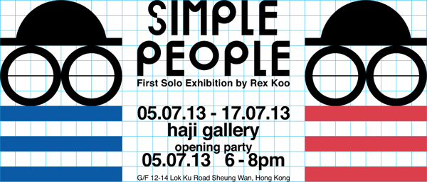
 HAJI Gallery presents “Simple People” by Rex Koo
Art Opening: July 05 (Friday), 6-8pm
Exhibition Period: July 05 – July 17, 2013
Venue: HAJI Gallery. G/F, 12-14 Lok Ku Road, Sheung Wan, Hong Kong Tel: 28911164
Opening Hours 2-7pm daily
Artist Statement by Rex Koo:
Simple People
http://www.facebook.com/
「在條件充足的情況下反而容易變得任性 ,簡簡單單是最難做到的。以人像畫為題材的話,我能在有
平面設計的經驗讓我觀察到一個現象,就是有時候人對事物
換言之這系列的人像畫並非單純只是人像畫,而是關於「取
Simple People
“In the case of being in a sufficient condition, outcome may tends to become inhibited instead, while staying simple is always the most difficult to achieve. If I set up a certain theme to myself when making portraits, would I still be able to express and outline the silhouettes, emotions and attitudes under limited conditions?” This thought triggers me to strive to create limitless from limited. The creative process deems tedious when considering it a game without any restrictions.
Being as a graphic designer has made me become aware of an interesting situation, that sometimes one’s memory and cognition of things are often dominated by subconscious rather than conscious mind. The audiences are unconsciously receiving the metaphor of shapes, symbols and colors; simple graphics could actually extract various kinds of associative connections.
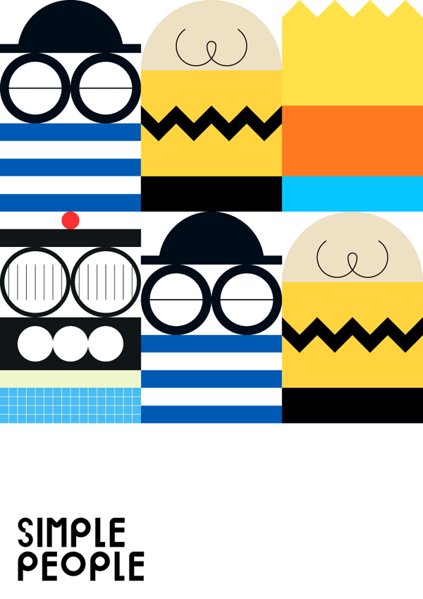
As a result, I’ve planned to create portrait artworks by using the most common element in the field of graphic design – Grids, with a restricted biggest size of 32×48 grids. I soon came to realize the three basic issues that is to be resolved prior moving on under the restrictions, “What to express? What to retain? What to abandon”?. One probably may not know which course to follow when spoilt for choice. Certainly the grids format does raise the difficulties of creation, however, it then becomes relatively simple once these 3 fundamentals are answered.
In other words, this series of artworks are not just merely works of portraits, they are too the process of “to choose & to abandon
About Rex Koo, The Artist :
Rex Koo是一位本地平面藝術家及設計師。從事平面設計超過
Rex Koo is a Hong Kong base Graphic Artist who has been working in graphic design for more than a decade, his work involves a massive amount of local music albums and movie poster design. Also he was one of the participating artists in Nike Hong Kong (2012), Homeless Dictator (Finland 2008), Get It Louder (China 2007) and The Place Project (Barcelona 2005). Rex believes graphic design aesthetics could sometimes be cold, rational and calculational; while painting comprehends the devotion of feelings, and that could be irrational and unrestrained.
At a period in his creative career, Rex has begun to blend hand-drawn elements into the design work, and devoted himself to painting as main career in these recent years. Compared to the painstaking graphic design work, Rex considers painting is an ongoing strenuous process with self-exploring and self-confronting.

